the patient station
•
CASE STUDY
•
the patient station • CASE STUDY •

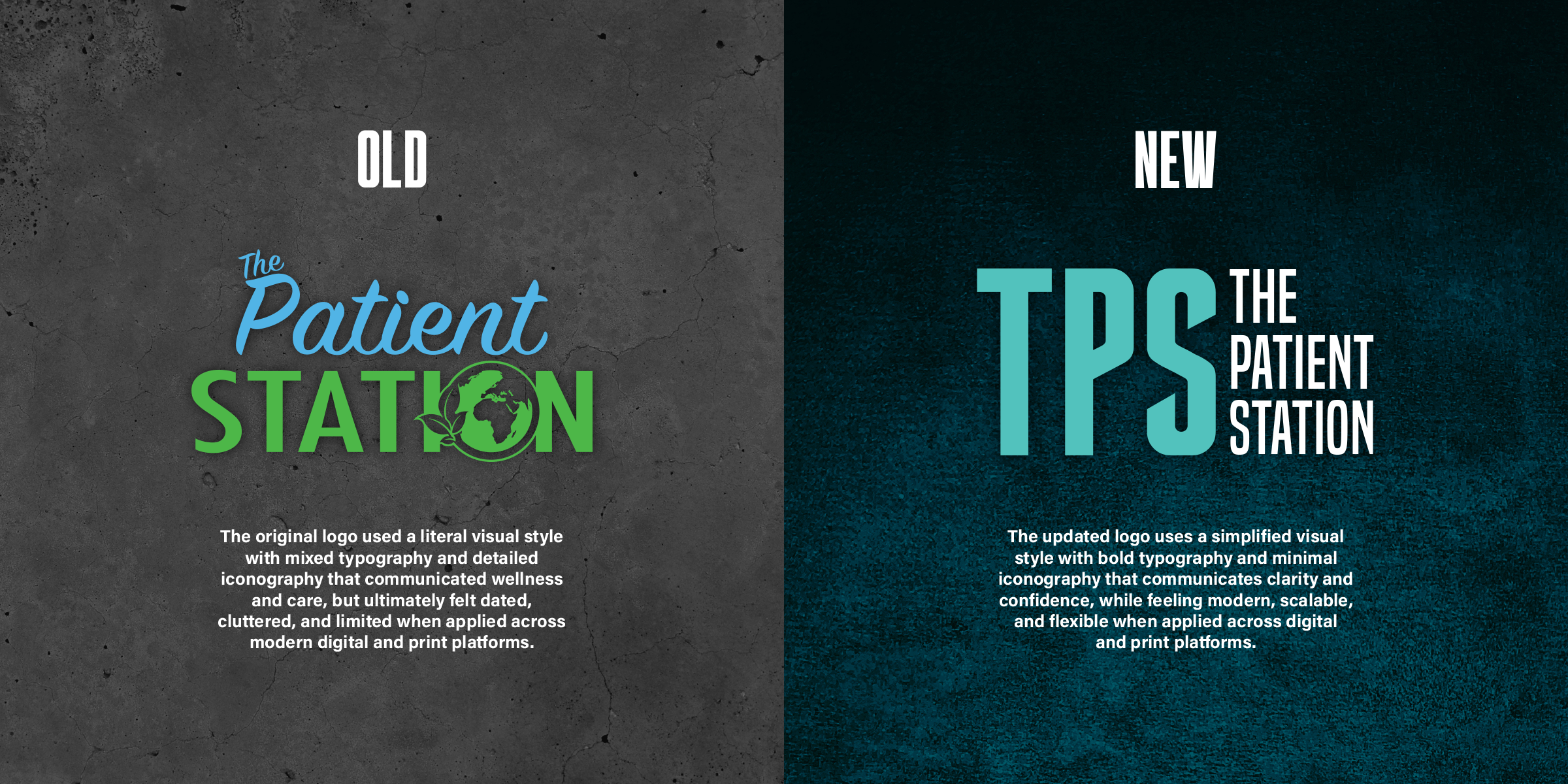
THE PATIENT STATION is a modern healthcare brand focused on access, clarity, and patient-first communication. The identity was intentionally redesigned to move away from outdated clinical or eco-themed visuals and toward something confident, trustworthy, and approachable. The brand needed to feel professional without being cold, modern without feeling corporate, and informative without becoming overwhelming. Care is framed as something that should feel understandable and accessible rather than intimidating.
THE VISUAL IDENTITY centers around a simplified, typography-driven system anchored by the TPS mark. Clean forms, strong contrast, and restrained color choices create a brand that is instantly legible and adaptable across environments. By reducing visual noise and focusing on hierarchy and clarity, the identity supports credibility while remaining flexible enough to scale across digital and physical touchpoints.
THE DIGITAL EXPERIENCE acts as a clear point of entry for patients seeking information and next steps. The website emphasizes readability, structure, and ease of navigation, guiding users toward resources, services, and contact without friction. Text promos and digital touchpoints extend the experience beyond the site, delivering timely, direct communication that reinforces trust and accessibility.
PHOTOGRAPHY, VIDEO, AND PHYSICAL ASSETS prioritize clarity and real-world use over decorative polish. Visual content is designed to support understanding, reinforce professionalism, and humanize the brand without distraction. The system was built to scale across locations, services, and platforms while remaining consistent as the brand continues to evolve.
Brand Identity • Website Design • Text Promos • Social Media • Photography • Video • Print Design